
Understanding WordPress & Bricks
WordPress is the content management system (CMS) that powers your website. WordPress is where you log in, manage your site’s overall settings, and access different tools. Think of WordPress as the main headquarters of your website.
WordPress Dashboard: The main control center you see when you log in. From here, you can access Pages, Media, Theme Settings, and other site management tools. The Dashboard is where you start before you open Bricks to edit a page.
Pages (in WordPress): The list of all pages on your website (Home, About, Giving, Contact, etc.). You find your pages in WordPress Dashboard → Pages. From here, you can click “Edit with Bricks” to open a page in the Bricks builder for editing.
Bricks Builder: The page design tool that opens when you click “Edit with Bricks” on a page. Bricks is where you actually edit the content, layout, colors, images, and styling of a page. It’s more visual and interactive than WordPress itself—you can see your page as you edit it and click directly on elements to change them.
How They Work Together WordPress manages your overall site (pages, media, settings). Bricks is the visual editor you use to design and edit individual pages within WordPress. You start in WordPress, then open Bricks to make detailed edits to how a page looks and feels.
Core Building Blocks
Bricks: The page builder tool we use to edit and design your website. When you go to Pages → Edit with Bricks, you’re entering the Bricks builder.
Section A large block of content on your page. Think of it like a horizontal band across your website. Your homepage is made up of multiple sections stacked on top of each other (hero, introduction, latest message, etc.). You can duplicate, delete, or reorder sections.
Container A structural element that holds content within a section. Containers help organize and align content. Most sections contain at least one container.
Column: A vertical division within a container. Columns let you place content side-by-side. For example, you might have a column for text and a column for an image in the same row.
Element: Any individual piece of content you can click on and edit. Text boxes, buttons, images, headings—these are all elements. When you click on an element, its settings appear in the left panel.
Navigation & Organization
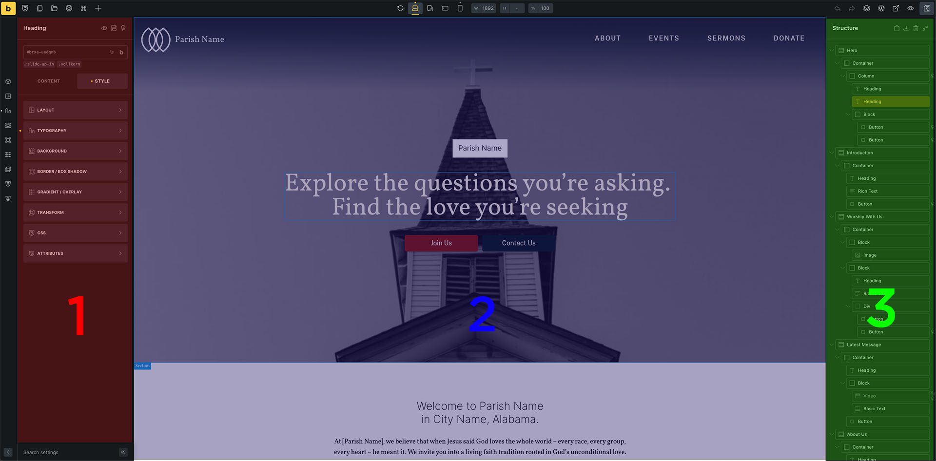
1. Left Panel (red): The control panel on the left side of Bricks. When you click on any element, the left panel shows all the settings and style options for that element (typography, colors, spacing, layout, etc.).
2. Middle Panel (Blue): The main editing area in the center of Bricks. This is where you see your actual page and click on elements to select and edit them.
3. Structure Tree (Green): The panel on the right side of Bricks that shows the hierarchy of all elements on your page. It displays sections, containers, columns, and individual elements as a nested list. Click on anything in the Structure Tree to select it on the page.
Styling & Customization
Style: The section in the left panel where you customize how something looks: colors, fonts, sizes, spacing, alignment, and more. When you click on an element and go to Style, you’ll see options like Typography, Background, Layout, etc.
Typography: The font and text settings. Includes font size, bold, italics, text color, line spacing, and alignment.
Background: The color or fill behind an element. Click the color dot to choose a new background color for a box, button, or section.
Layout Controls spacing and positioning. Includes width, height, margin, padding, and alignment options. This is where you control how much space something takes up and how it’s positioned.
Object Fit controls how an image fills its container. Options include “cover” (image stretches to fill the space) or “contain” (image stays at its original proportions).
Aspect Ratio: The proportions of an image or element (how wide vs. how tall it is). You can lock an aspect ratio to maintain consistent proportions when resizing.
Content Management
Media Library: The central location (WordPress Dashboard → Media) where all your photos, videos, and PDFs are stored. You upload files here, and then use them throughout your website. Multiple people with access can see and use everything in the Media Library.
Alt Text: A written description of an image for accessibility. It’s read aloud by screen readers for people with visual impairments and helps search engines understand your images. Always add alt text to important images.
Saving & Previewing
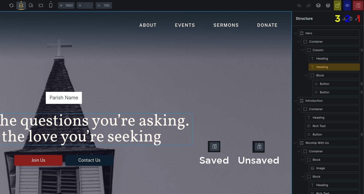
1. Save Button (red) is located in the top right corner of Bricks. Click this to make your changes live on the website. Don’t click unless you intend to save.
Dot (Unsaved Changes Indicator) A small dot that appears above the Save button when you’ve made changes that haven’t been saved yet. Once you save, the dot disappears. You can view this in the screenshot
2. Preview (Eyeball Icon) (blue) shows you what your changes will look like before saving. You can’t edit in preview mode, but you can see the result. Useful for checking how changes look before committing them.
3. View on Front End (yellow) Opens a new tab showing your live website as visitors see it. Use this to see the final result after saving. If you click this without saving you will not see any change.
Responsive Design
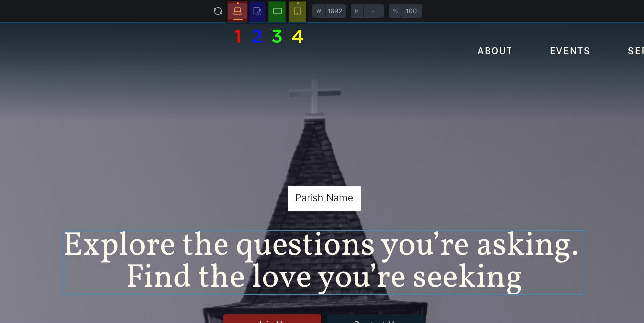
Responsive Editing: The ability to edit how something looks on different devices. You can adjust font sizes, hide elements, or change spacing specifically for mobile without affecting the desktop version.
1. Desktop (red): How your website looks on a computer. Shown in the top toolbar of Bricks.
2. Tablet (blue): How your website looks on an iPad or tablet device. Click the tablet icon in the top toolbar to see this view.
3. Mobile Horizontal (green): How your website looks on a phone that is turned sideways. Not usually worth checking as most users in today’s age don’t use this view.
4. Mobile (yellow): How your website looks on a phone. Click the mobile/phone icon in the top toolbar to see this view. Most of your visitors use mobile, so always check this view before saving.
Common Actions
Duplicate: Make an exact copy of a section, container, or element. Click the “+” button next to the item in the Structure Tree to duplicate it. This is the safest way to add new content because you’re starting from something that already works.
Delete Remove an element, container, or section. Click the trash icon next to it in the Structure Tree. Be careful—this can’t be undone unless you refresh without saving.
Drag & Drop Click and hold an item (like a section) and drag it to a new position. Use this to reorder sections on your page or move elements around.
Insert / Attach When you’re selecting an image or linking a button, “Insert” adds the content to your site. “Attach” connects content to your page.
Learn More
Bricks Builder Official YouTube Channel https://www.youtube.com/@bricksbuilder
The official Bricks Builder channel has tutorials, walkthroughs, and tips for getting started and beyond. If you want to see how something works in Bricks, searching their channel is a great resource.